
Case Study #1
Not just a grocery list app. Allot is built around the efficiency of the entire grocery run.
Designer & Team Representative
Duration
Jan – Mar 2026
Team
5 UI/UX Designers
Outcome
Results from usability testing on 5 participants
5 / 5
Participants completed all core task flows with no critical failures
4.3 / 5
Average satisfaction rating across all post-test responses
100%
Participants said multi-store feature aligned with real shopping behavior
00 - Project Overview
What is Allot, and why does it exist?
Allot is a mobile app concept designed for people who share a home and share the work of keeping it stocked.
Whether that's roommates splitting grocery runs, a couple trying to stay in sync, or a family dividing errands… the coordination problem is the same: too much relies on memory, informal messages, and assumptions about who's doing what.
The design challenge: How might we reduce the cognitive load of shared grocery planning by organizing tasks around the way people actually shop — not the way reminder apps assume they do?

Whats the core idea behind Allot?
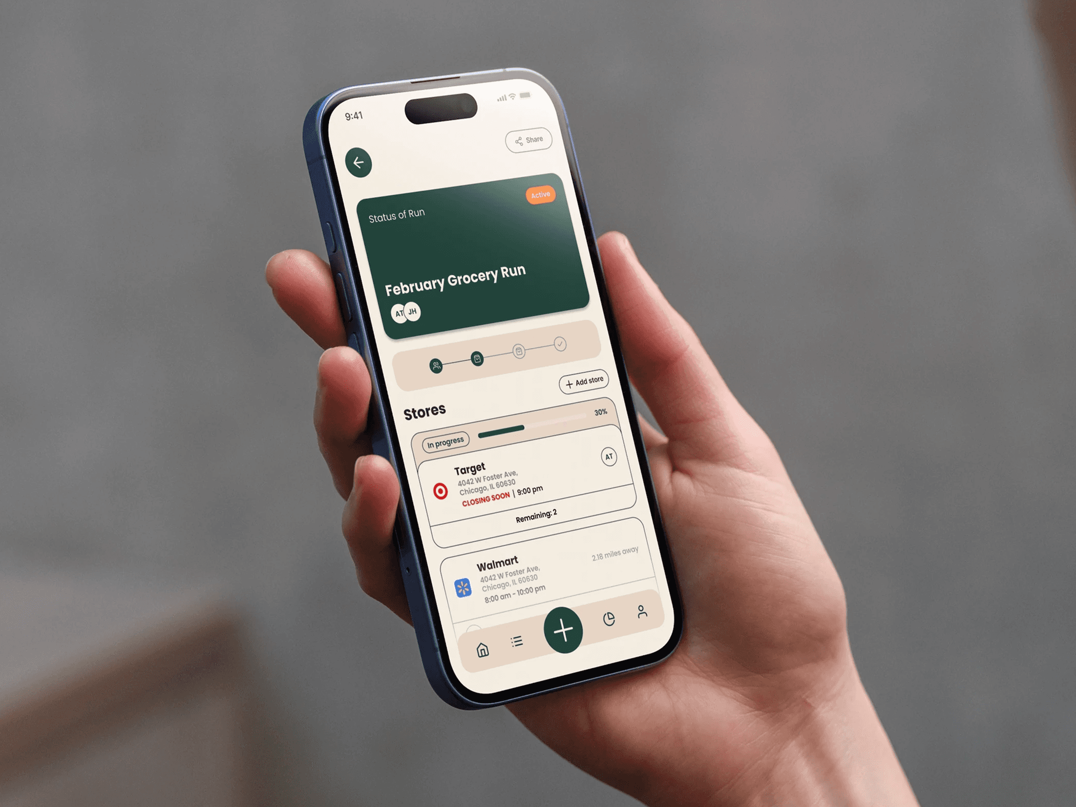
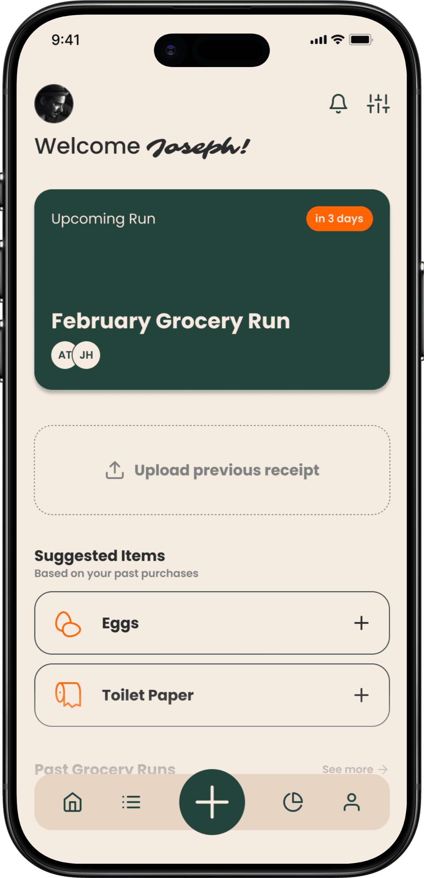
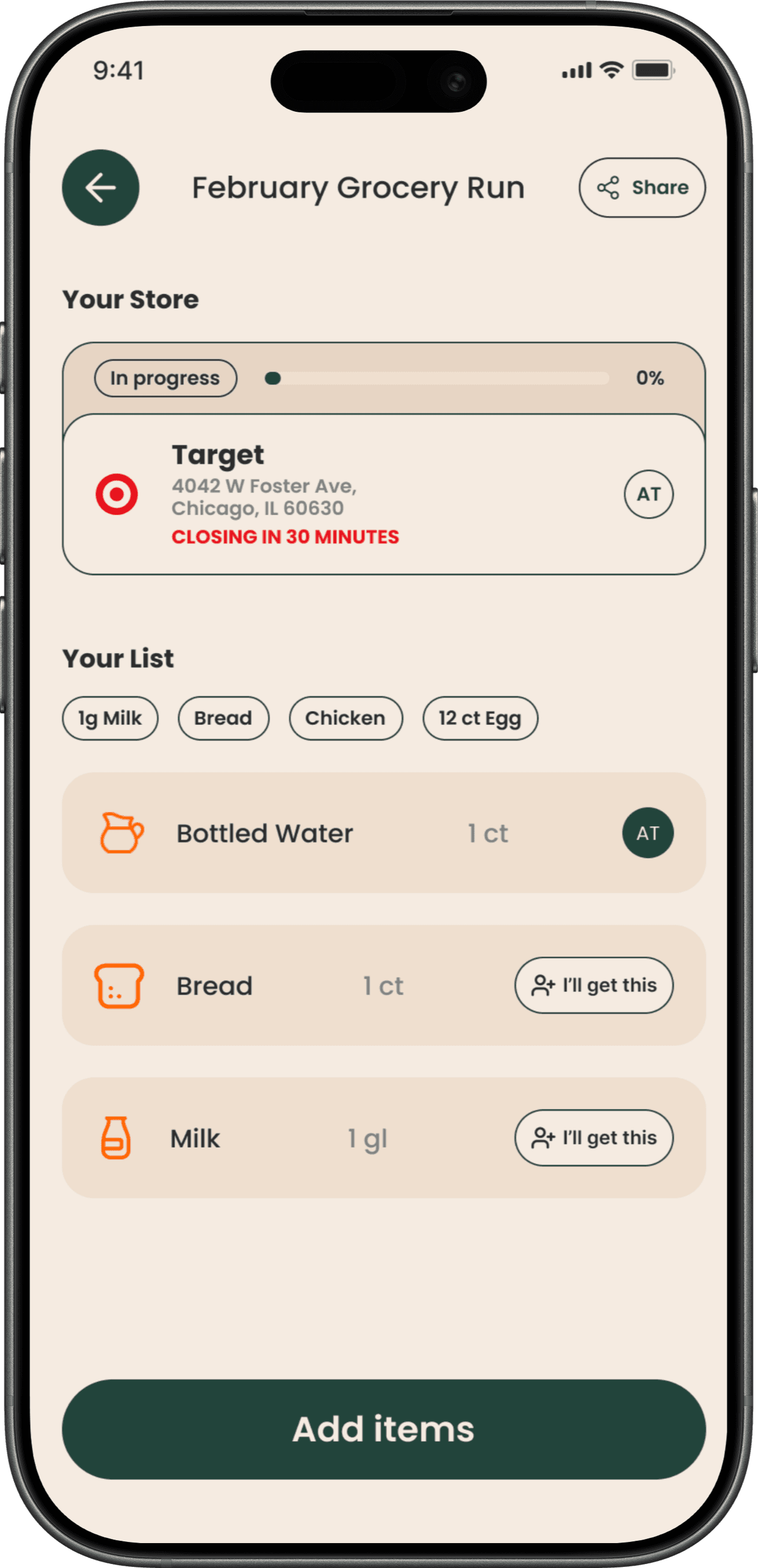
The core idea behind Allot is the grocery run: a planned shopping event that groups items, stores, and household members together in one place. Instead of a flat list everyone forgets to check, a run gives a shopping trip structure, visibility, and shared ownership.
Grocery List
Flat, no structure or sequence
No store context — just item names
No ownership — unclear who's buying what
No coordination — each person works in isolation
Forgotten until you're already at the store
Vs
Grocery Run
A structured shopping event with a clear purpose
Items organized by store — know exactly where to go
Shared ownership — each item has a responsible person
Household-wide visibility — everyone stays in sync
Planned ahead — not reactive, proactive
01 - Problem Statement
Shared households run on memory — and memory fails
Managing groceries with roommates, partners, or family isn't just a logistics problem — it's a cognitive one. People constantly juggle what to buy, where to buy it, and who's responsible. The result? Forgotten items, duplicate purchases, and unnecessary extra trips.
Existing tools like Apple Reminders, Google Keep, and Bring! let you create lists — but they treat every item as an isolated task. They don't account for who is buying, where they're going, or when they're going. The contextual glue is missing.
The User Problem
Too much to remember
The Design Opportunity
Externalize the context
02 - Design Process
Phase 1
User Research
5 semi-structured interviews + sentiment coding to surface 7 core themes
Phase 2
Competitive Analysis
Evaluated Bring!, AnyList, Apple Reminders — found gaps in contextual planning
Phase 3
User Flows
Swim-lane diagrams iterated twice — added onboarding, notifications, multi-user flows
Phase 4
Wireframes
Low-fidelity wireframes to map out core screens and task flows before visual design
Phase 5
Prototyping
Hi-fi Figma prototype built around the grocery run concept with multi-store support
03 - Research & Insight
What we heard from real users
We led semi-structured interviews with 5 adults in shared households, exploring their current behaviors, frustrations, and mental models around grocery planning. We then applied sentiment coding to surface recurring themes.
From insight to design principles
01
Externalize memory. Store contextual details — what to buy, where, who's responsible — so users don't have to.
02
Support shared coordination. Make shared responsibility visible and manageable within a single system.
03
Reflect real-world behavior. Organize tasks around shopping trips, not abstract lists.
04
Stay simple and transparent. Don't overwhelm users. Only automate what users control and understand.
A major pivot came when early feedback showed users didn't just need shared lists — they needed a way to see who was part of their household and manage responsibilities across those members. This led to introducing group creation and member invitations as core features.
04 - Solution
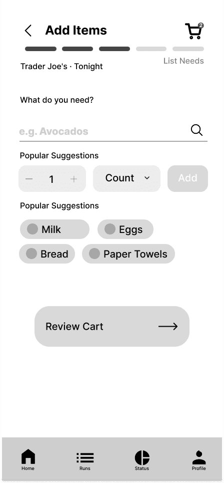
The "grocery run" as a design object
The central innovation of Allot is the grocery run, a structured shopping event that bundles items, stores, and household members together. Rather than a flat list, a run has context: it knows where you're going, what you need from each place, and who's handling what.
We started off by mapping out the flow for the user
We then moved into low-fi wireframe and internally evaluated the flow then created mid-fi wireframes after feedback
Low-fi

Mid-fi wireframe
After another internal evaluation and informal usability testing done with users close to us we moved to Hi-fi wireframe


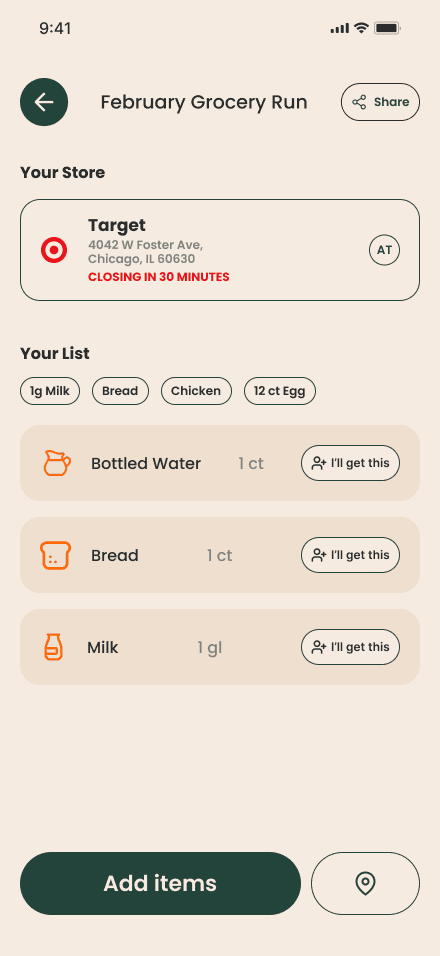


Hi-fi wireframe
05 - Impact
Usability testing with 5 participants
We ran moderated think-aloud sessions testing four core task flows: account creation, creating a grocery run, adding a list, and adding stores. Results were strong across the board.
5 / 5
Participants completed all core task flows with no critical failures
4.3 / 5
Average satisfaction rating across all post-test responses
100%
Participants said multi-store feature aligned with real shopping behavior
What I'd do differently
The biggest friction point was onboarding — users understood the system only after exploring it, not on first glance. The relationship between runs → lists → stores needed to be surfaced earlier, perhaps through a guided first-run walkthrough or progressive disclosure during account setup.
With more time, I'd also run longitudinal studies. Allot is fundamentally a habit-forming tool, and 20-minute usability sessions only tell part of the story. Real-world performance over weeks would validate whether the grocery run concept sticks.