
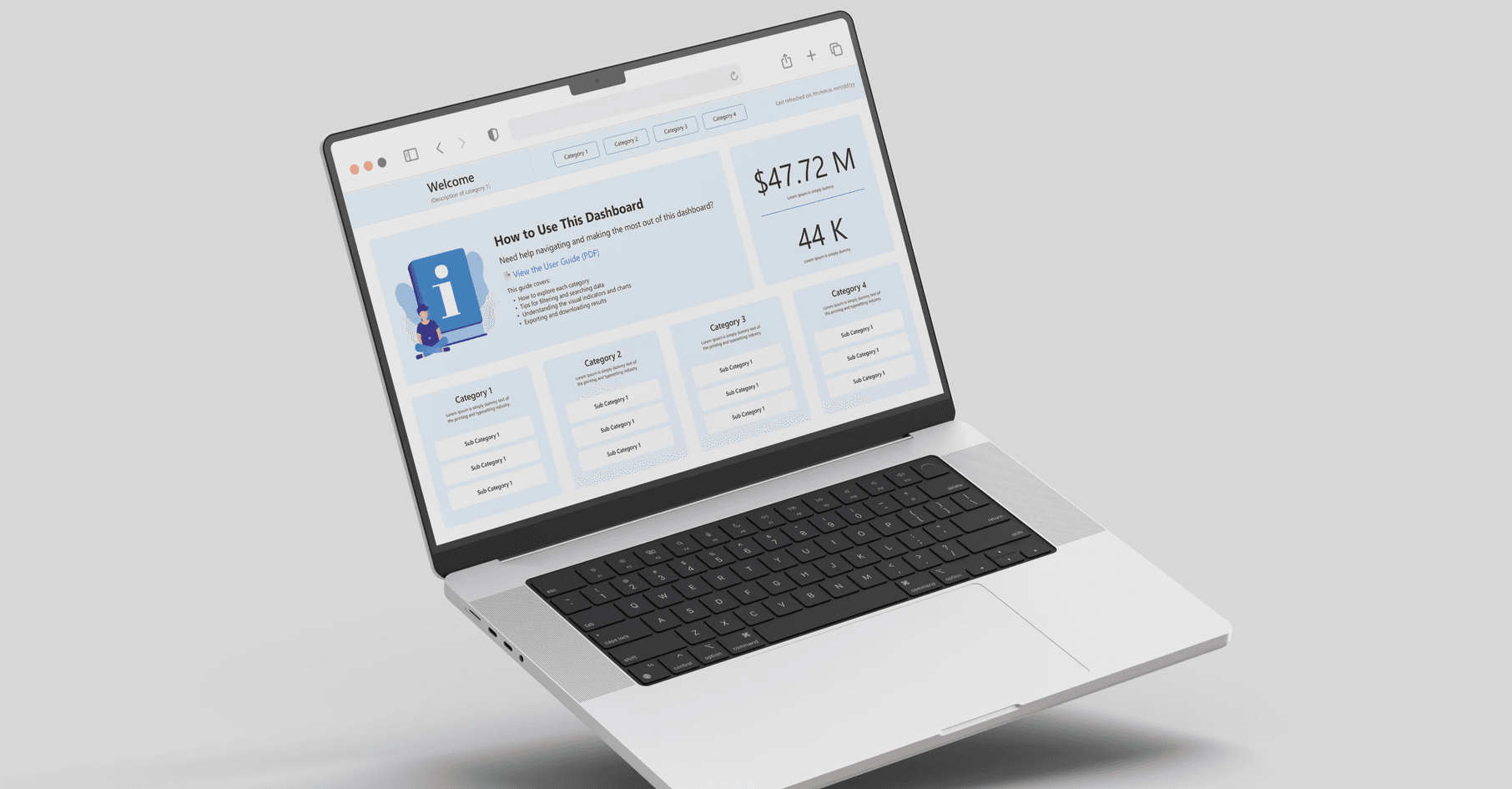
Power BI dashboard for a global company’s sales team.
My Role: UX Designer
User: Sales Department
Timeline: 3 Months
Project at a glance
This project involved helping a large global sales team move away from manual Excel reporting. The goal was to automate metric generation and create clear dashboards using Power BI to support faster, data-driven decisions.
Outcome
Predicted decrease of login fallouts by 31% with some design enhancements releasing in August and the rest being placed on the 2026 company roadmap.
Problem
How can we significantly improve the customer login experience, reduce login abandonment, and ultimately increase take rates and conversions?
Process
This project was a collaborative effort between design and data teams. I worked alongside another UX designer and three Power BI specialists to transform a manual Excel reporting system into an automated, structured dashboard.

2 Designers

3 Data Scientists

1 Scrum Master
Project Process

Research — Defining the Real Problem
The existing reliance on manual Excel sheet
Manual Updates
Manual Updates
Cluttered Visuals
Cluttered Visuals
Steep Learning Curve
Steep Learning Curve
Too many tabs, too little value
Too many tabs, too little value
User Sentiment: Overwhelmed & Underserved
